Being the designer of this project doesn’t necessarily mean that i have to jump straight in and start making graphics but i have to start from making a research about who the application is aimed for .
Our target audience is from 17- 24 years as this is the age group aimed at enrolling for college. We did look at a few websites that offer information on what they might be looking for in joining a particular college and this information is very important in building our application. this website gave us good tips to look out for
http://www.amesprep.com/info_10things.htm
1- Size
2- Location
3- Type
4- Distance from home
5- Cost scholarship and financial aid
6- Majors and requirements
7- Athletics and events
8- Activities and social programs
9- Gut feeling
10-Accommodation
Logo Design
We have the task to brand our selves and this is something we took very serious because its what represents not only who we are but what the project is.
we held meetings as a group and discussed what the name of the application should be. it was not something we could decide ourselves so we listed out few ideas from each member and we got our mentor to choose for us and the name that stood out was “peekdkit” once this was decided i researched about logos and most importantly contemporary logos since we are looking for a clean, modern look for our overall website.
once i was happy with my collection of images that i thought where strong , i started sketching

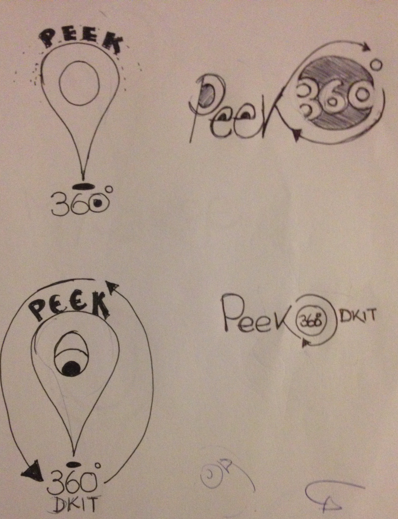


We showed the above sketches to our mentor who helped us narrow down which one is best representing our application and we chose to stick with this one that has the camera, and the eye which the simple text as its day to remember and easy for anyone to sketch. a “Behance.net” website offers tips to follow when designing a logo which are listed below.
- Does it work vertically?
- Does it work without a box around it?
- Can you sketch it?
- Less than two fonts?
- Abstract comes before literal?
- The brand is the sum of everything. The logo isn’t
- A logo is an impression, a suggestion, a clue
- A logos job is to provide a legible, recognizable, face to your brand
- Don’t ask blue or green, ask technical or trend
- 10. Define the brand then execute.
- Face it, someone isn’t going to be happy with your choice

Website
The website will have a contemporary look and feel. This was decided due to the research we had done as we looked at our target audience from what they are into ranging from fashion, social sites they visit, websites they visit, websites that are targeted to this age group,and also reading about designing for teens on the website below.
http://www.nngroup.com/articles/usability-of-websites-for-teenagers/
Icons
Because we are looking at a clean and simple touch, we decide the way to achieve this is get away from traditional websites that have a lot of information. So we took the road of using icons for navigation. Icons are use almost every where from road signs to the simple Microsoft word on computers so this is something we can interpret even for people who done read english.
We looked at a few websites that have taken on this style of navigation and we got to see how clean how they have a lot of space on the site.
http://www.awwwards.com/31-examples-of-icons-in-navegation-menus.html
We sat down and sketch a few mock ups of how we want our buttons to look and feel and these are everyday icons that any one can interpret easily. They are not final we might change them as we go along
![]()


Colours
Everything that is on trend now is all designed using cool and warm colurs. the age group we are designing for is following this style as well from fashion to interior design. We did research websites that are intended for this age group and the majority of them used cool and warm colours.


Our application will combine both cool and warm colours and we thought the best ones to use would be the ones below although it’s not final but we feel like they are working well with the audience we want to reach out to.

Fonts
According to “webdesignerdepot” website, they listed what typeface to consider for which particular work you are designing whether print or web design. For web design, they listed reasons why it’s best to use san serif fonts and labeling it as modern, minimal and magnificent. We are working with a website and we will take not of what their research proved and use the sanserif font.
Web design about.com website also mentions why its not very clever to use serif fonts for web design as computer screens do not have a high resolution as paper and once serif fonts are used, the little serifs can blur and start making the text harder to read.
Urban fonts website offers a wide number of free to use. We did find a few fonts good to use because they are modern, clean and friendly
- Slimania font
- FolksDecoon font
- Helvetica

Feel and look of website
With all the information gathered above, its time now to put it all together to create the look and feel of our website and as much as the style might change, we expect to have it simple clean and easy to use for our target audience . We will keep all the pages consistent such that you can easily navigate your way to any page at any time. The navigation bar will be placed at the top and will be available for you to use on whatever page you got to.

Mood boards
Webography
peterson.com. (). 10 things you should consider when choosing a college. Available: http://www.amesprep.com/info_10things.htm. Last accessed 19th Feb 2014.
Dieter Schumacher. (). slimania. Available: http://www.urbanfonts.com/fonts/Slimania.htm. Last accessed 19th Feb 2014.
tRyMe. (22 april 2009). effect of colour in web design. Available: http://erlichmis.blogspot.ie/2009/04/effect-of-color-in-web-page-design.html. Last accessed 19th Feb 2014.
awwwards. (). 31 Examples Of Icons In Navigation Menus. Available: http://www.awwwards.com/31-examples-of-icons-in-navegation-menus.html. Last accessed 19th Feb 2014.
orja Acosta de Vizcaíno. (2014). 11 steps to a perfect logo. Available: http://www.behance.net/gallery/11-STEPS-TO-A-PERFECT-LOGO/12463667. Last accessed 19th Feb 2014.
The mock ups for designing our project graphics has finished and now we are mooing on to real design and feel for the website, logo, poster, business cards, and flyers. The design process is very important at this stage because its what is going to be our sale factor and as it involves a lot of work, our supervisor has decided i get more help from Kevin who is in charge with the audio but he has not got busy yet in that department and therefore Kevin decided he will deal with the stationary part of the design and i can concentrate more on the icons and the website feel .
Our website will be a parallax one which means it will be scrollable. therefore, i looked at websites in this category to get the proper feel of what i have to look out for.
we are going for minimal and clean design so all the icons i designed before during our mock up we have to avoid using them because they do clatter the page. We designed other ones still keeping with cool and warm colours to see how they feel on the website 


The icons looked good and we seemed happy with them however, when we imported them to the website, they didn’t fit in as they looked a bit very childish than the age group we are working for .
we looked at different websites that are clean and use icons and a few of them stood out like the ones below


The above just like most of the parallax websites that use icon navigation rely on imagery and more space so we knew our icons should be flat design clean and impel so we drew one to see how it will look
i
this looked pretty good so we decided this is what we will go for. However, when we placed it on the web document, because of our colour choice, still it didn’t feel good. we then designed a few pages to see which one will work better and from the ones below we will chose the final piece. the logo used on these images is just an icon for design purposes as we are still working on our final look of the logo.
HOME PAGE
HOME PAGE

INTERVIEW PAGE  http://www.bebo.com
we did try to come up with few designs of ours business card design but we decided we are going to change the logo so we will have to work on the business cards too.


mezcalbuenviaje.com. (). mezcalbuenviaje. Available: http://www.mezcalbuenviaje.com. Last accessed 10th may 2014.
http://www.numero10.ch. (). nº10. Available: http://www.numero10.ch/fr/home. Last accessed 10th may 2014.
bebo.com. (). bebo. Available: http://www.bebo.com. Last accessed 10th may 2014.
WORK IN PROGRESS
After the presentation of our work in progress, we did get positive feed back from the lectureres which we want to work on and get better results. we feel like we are on the right track but i still can achieve better graphics so i decided to research more into how to achieve this.
i did get permision ahead from our supervisor to use the CMDKIT logo which i think we can use along side our “peekdkit” logo.
i went back to the home screen of our page and looked for ways in which i could make it appealing and i made a few changes on the font although i still feel like a lot is missing on the front page and i am going to try to improve it and the log to will going to be changed as wee feel it still doesn’t carry the message of the website

Since we are going to have interviews and panorama shots of different departments, we had to design the look and feel of this pages and i did this before our WIP but i knew there was a lot of work to still be done and now i have come up with not one but many ideas to choose from.
when you enter a panoramic shot, it will have a lecturere in the class with a few students doing work on projects and as u scroll , pop ups will appear over the lecturers head or over the students and you will have a chance to click the play button for the interview

we did decide to use the CMDKIT logo to give it a professional look

the play button wasn’t looking so well although it does stand out and by looking at it you know that its a clickable play button and this will take you to the interview page of either the lecturer or the student . i made it even better by changing the square button to a circle on like below

The rooms do have important and new technology softwares that we would like to show off so we decided that hot spot will appear over these technologies and once a hot spot is hovered over, it will then give you a brief description of what the technology is and what its for
 hot spot with an info sign

The way in which the text should be displayed when the info button is hovered over was to be a tricky one because we didn’t want to over populate the screen with text boxes so i came up with a few ideas like the one above and the ones below


They all seemed to work but some how looking off page so we decided we will go with the one below for our info message because its not in your face and still stands out to be noticed when it appears on the stage.

For the interview lay out, we will keep clean and simple just as the rest of the pages. we want to only display the name of the lecturer or the student since we have already shown some information on the pop up button and as also they are going to introduce them selves so the idea that i had come with is going to be scrapped and i am going to work on a better interview page but the one i did have before was to look like this although it is now going to be changed 
During the video recordings and the panoramic shots we all took on different roles and my role was to light up the scenes and make sure we killed the shadows and produced industry standard shots and videos. this went well and we are still to shoot more interviews and we will use the same techniques as used before 
